

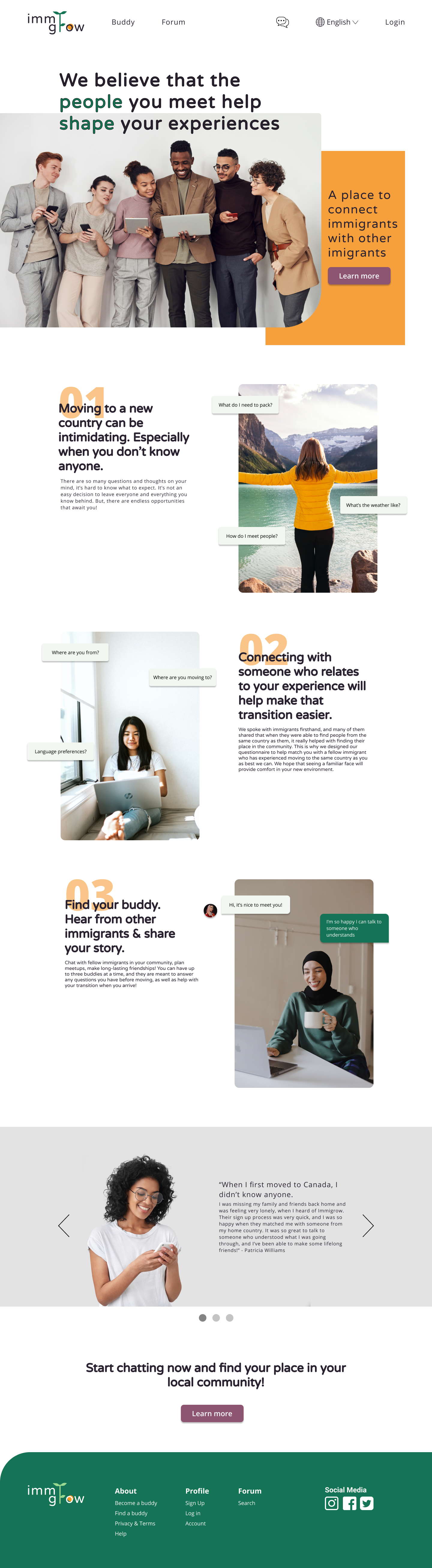
Immigrow is a company that helps connect immigrants with other immigrants, particularly those from the same country as them. Canada is known to be a very multicultural country, with almost 300,000 immigrants coming to Canada in 2020 alone. Because of this, Immigrow has became interested in how immigrants are able to meet people and connect with their local communities.
Design a responsive website that helps immigrants with their transition in moving to a new country, meeting people, and getting familiar with their local community.
UX/UI Designer, UX Researcher, Branding
Figma
Feb-March 2021 (two weeks)
Immigrow
.gif)
🤔 What decisions lead people to immigrate to a new country?
🏡 How do immigrants prepare to move to a new country?
🧠 What are the main challenges of moving and living in a new country?
🌎 How do people connect with their local communities?
👥 What is their experience like with connecting and meeting new people?
I decided to research about why people migrate to new countries, and some of the major problems that they face when doing so. Some of the problems that stood out the most and that came up in my user interview results were:

I wanted to hear more about the immigration experience directly from those who have experienced it. This is why I decided to conduct five interviews, all with people who have moved to a new country before. These interviews were conducted remotely over Zoom. Some of the questions that were asked to help me try and understand what they were going through were:
These questions led me to some valuable insights, and helped me better understand what users were going through and valued when moving to a new country:

I had first started doing my competitive analysis before my user interviews, but after hearing from our users I realized that the project was going in a different direction from what I had planned. Originally, I thought Immigrow was going to be a website that provided immigrants with information about where they are moving to, but my research told me that what people really needed to help them find their place in their community was the social aspect. So I decided to take a look at where immigrants would currently be looking to connect them with other people.

Three major gains that I took away from this which helped shape the direction of my project were that:
There was no platform that existed just for immigrants
I wanted to create a more personal experience, so that users know exactly who they're talking to, where they're from, and be able to match a face to the name
People need to be able to start discussions (whether that's in a chat format, or forum section)
After conducting the interviews, the research was first synthesized with an empathy map to narrow down on anything that was unique or came up frequently.

Some insights that I learned were:
A few people had someone to talk to before coming so they had an idea of what to expect, but also had to figure out a lot of it on their own once they arrived.
When meeting fellow immigrants from the same country, they are very friendly and welcoming, and willing to help out.
There aren't a lot of cultural events that take place, but they also likely wouldn't go if they didn't know anyone beforehand.
Food, family & friends are what people miss the most about their home country.
At this point, I was starting to realize that Immigrow could be applicable to immigrants all over the world, not specific to Canada. Although each immigrant experience is unique, there were certain themes that were the same regardless of what country they were going to or coming from.
Tim is a young businessman who is looking to move to Canada from Thailand to start a new life with his fiance. They don't know anyone currently living there, so it's been hard for them to know what to expect, and they are nervous about meeting new people. They wonder if they will be able to find fellow Thai immigrants, and get accustomed to their new community.

"Immigrants need a way to connect with people in order to find their place in their local community."
Before I came to conclusions on how to solve this problem, I wanted to make sure I explored different ideas. I decided to sit down for two 15-minute intervals and brainstorm all of the ideas that came to my head of how I could potentially solve the problem. It was a helpful exercise, and a lot of these ideas I took with me into my designs, or would like to implement in the future.


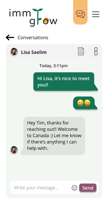
From this brainstorm, I decided that the buddy system would be very valuable as it would help users connect with a fellow immigrant from the same country as them. They would also be able to chat with them and ask any questions they might have. I explored this idea more in my feature roadmap.
As seen from Tim's goals and our problem statement, a very important goal is for immigrants to meet new people, especially people who come from the same cultural background as them. By doing this, this would help solve a lot of other goals that the user is having as well, such as with their transition living in a new country.

To expand on the buddy system from my brainstorm above, I came up with a list of features that would complement this, and make the experience of meeting fellow immigrants easier. I focused on the P1 features.

The direction that my website was taking was to bring people together and connect them, so there weren't too many navigation items that were needed. I focused on the main feature, which was for users to find a buddy, and once they do they can start chatting with them. The secondary place they could go to for information would be the forum page.

I focused on a specific task that a user would take, which would be to find a buddy to talk to, and thought of all the different paths that a user could take to get there. There were a few things that I had to consider which would affect some of their decisions, such as:

Since finding someone to connect with was one of the biggest ways of solving our user problems, I wanted to make sure that my designs focused on this. Beside the homepage, I decided that the chat design was something that I needed to prioritize, as this would be the first point of contact that users would have with the buddy they are paired with.
To first test out my ideas, I sketched them out on paper:


I went through a few iterations of these wireframes until I got to my final result. What helped me with my iterations was performing a heuristic analysis after my first set of wireframes, which helped me point out any usability issues that a user may come across. Some of these changes included showing how many buddy matches there were, so that users know how many there are to scroll through, as well as adding a close/exit option to get out of the questionnaire. Not all of the usability heuristics were applicable at the time, but I was able to keep them in mind as I continued to design more screens.


As I worked through these wireframes, a few ideas that changed between my initial ideas and the final result were:


For the responsive wireframes, it took a couple of iterations to figure it out, especially the navigation. I wanted to make sure it stayed consistent as the screen size got smaller, so that users could always expect the same thing when accessing the hamburger menu. Also figuring out the navigation of the chat, if it should be a page that you exit out of or go back to the previous page, versus if it should have the same navigation as the other pages.

I put together a moodboard to start thinking about how I wanted the brand to be portrayed. Some keywords that were helpful in finding these images were:
I noticed that there were a lot of similar patterns, such as hands, plants, and people, which were being used to represent these keywords that I had searched up. There was also a lot of bright and bold colours, which made it look very warm and inviting, and something that I kept in mind when selecting my colour palette.

I decided to go with the chosen logo because I felt that it represented the growth that immigrants would experience in moving to a new country, and it also suited the company name, Immigrow. The long line of the plant stem between the words also showed that Immigrow connects people and brings them together.
As I was preparing to put together my responsive UI designs, this was a good reference to have.

For the homepage, I decided to play around with the arrangement of the hero section, as well as layers and overlapping elements to add some dimension. I wanted to make sure to implement curves here, as well as with the footer and images, as I thought that it gave a very comforting and welcoming touch to the homepage. I focused on using the orange colour as my primary brand colour, to highlight anything important and to help with navigation. Green was used as a secondary colour to enhance certain elements of the page.


Making the chat responsive was the most challenging part. At first, I was showing past conversations on the same page as the chat, but it was getting hard to reduce all this on one page in the mobile view. Instead, I decided to add a separate page dedicated to viewing all the conversations, and have the chat be the main focus on it's own page.


Users were given the role of my persona, Tim Saetung, and were asked to fill out the respective form fields. Once they finished signing up and getting a buddy, they were told to start chatting with them. This was the main task that I had focused on when creating my user flow, so I designed all of the respective screens that were necessary to complete the task. I thought it was important to test this scenario to see where users go to access the questionnaire, if they have any problems going through the buddy process, and be able to choose who they want to start chatting with.

.gif)
They were then asked to pretend that they were coming back to the site a month later, and remembered that their buddy had sent a link about a restaurant. They were also reminded that they already had an account. I wanted to see if they were able to navigate to the chat from the homepage, and know where to look for the links that were sent in the chat.

The test was conducted remotely over Zoom with four participants. I watched them complete the given tasks on the high-fidelity wireframes, with the tests ranging between 15-20 minutes. All participants were able to successfully complete the tasks, but had more trouble with starting off scenario #2.
Below are the average scores of how easy the four participants found each scenario:
Since each of my scenarios tested certain parts of the website (scenario #1 tested the signup/getting a buddy, and scenario #2 tested accessing the chat), I decided to categorize my findings like this. For each of these tasks, I separated it further by the wins and difficulties that users had, and any suggestions that they gave me about that specific part of the website. Other feedback that was collected was separated into general suggestions not related to the getting a buddy process or the chat, any successes or impressions that the users had, and observations that I had when watching users interact with my site. Something that surprised me is that everyone went straight to the buddy page through the navigation at the top, and didn't use the "Learn more" CTAs that were on the homepage.

I focused on the changes that I wanted to implement right away:


If you're interested, you can view the final prototype below:
One thing that users seemed curious about is if more questions could have been asked when pairing you with a buddy, that would help finding the best match. For example, some of these questions could be hobbies, gender, and age. I had actually considered these questions when I was putting together the questionnaire, but I wanted to keep the questions simple at this time. I felt that location played a big factor in helping find a buddy, because you would want to find someone in your community, so these were important questions to ask. Originally, I thought about the users being immediately paired with one person in particular, but I thought about if people didn't like who they're paired with or wanted options, which is why I added in the page to select your buddy to give them more options. That way, people can browse a couple of options that best matched the information they entered, and they can try and choose someone that matches them based on their descriptions. However, in the future, I would like to do more research to see if these extra questions would be valuable in this process.
Additionally, I mentioned before that this originally started as a project specifically for Canadian immigrants, but throughout the project I realized that it could be applicable worldwide. I don't think that there would be too much to change in order to do this, but I would want to investigate more, and perhaps see how immigration differs in different countries.
Lastly, I would want to test out the extra chat features that I had originally thought of adding, such as the map and calendar. I thought these would be helpful if users are planning meetups with their buddies, and they aren't that familiar with the area. However I'd like to see what our users think of these ideas before they're implemented, since at this time these extra features don't directly affect using the chat.
Although I don't have my own immigrant experience, I have a lot of family and friends who have moved to a new country, and I admire how courageous and hard it must have been at first. That's why I became interested in providing a platform that could help them in the best way possible, and I learned through my research that improving the social connections could be one of the ways. Since I didn't know what the experience was like, it was a bit tricky coming up with the right questions to ask, but it was very helpful to hear firsthand from immigrants during my interviews and try to put myself in their shoes. The research for this was tricky, as there were many directions that it could have taken me, but I'm glad that I was able to approach it with an open-mind and not jump to any conclusions right away.